I like clever logos. I don't like complicated, contrived ones.
The logo for the Year of Faith 2012 - 2013 is complicated, contrived and....clever.
Never have I seen so many symbols gathered together in one small space contributing to an overall image - that works!
But YoF does it! Congratulations to those involved in its creation.
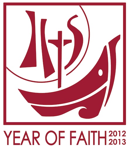
So, what do you see? A cross, a host, the IHS acronym, and a ship (barque of Peter?) that pulls the whole graphic image together very neatly.
But...can you also see Jonah's whale? Or, is that a graphic too far?
Anyway, the whole concept works (if you study it which you aren't supposed to do with logos).
Hooray and huzzah for something good.
The logo for the Year of Faith 2012 - 2013 is complicated, contrived and....clever.
Never have I seen so many symbols gathered together in one small space contributing to an overall image - that works!
But YoF does it! Congratulations to those involved in its creation.
So, what do you see? A cross, a host, the IHS acronym, and a ship (barque of Peter?) that pulls the whole graphic image together very neatly.
But...can you also see Jonah's whale? Or, is that a graphic too far?
Anyway, the whole concept works (if you study it which you aren't supposed to do with logos).
Hooray and huzzah for something good.
No comments:
Post a Comment